In this article, the author provides a guide on creating additional content for the homepage of a website. The content includes best-selling products, latest products, full banners, and new articles. The author uses the UX Builder to continue editing the homepage, creating components such as Row and Gap to organize the content effectively. They also add components for best-selling and latest products, adjusting settings to display the desired number of products. Additionally, the author includes banners and blog posts on the homepage. The article ends with a preview of the website and a mention of upcoming edits to the footer section in the next article.
In the previous article, I detailed creating the homepage header with diverse banners. Now, let’s delve into crafting additional content for the homepage, covering Best-selling products, Latest products, Full banners, and New articles.
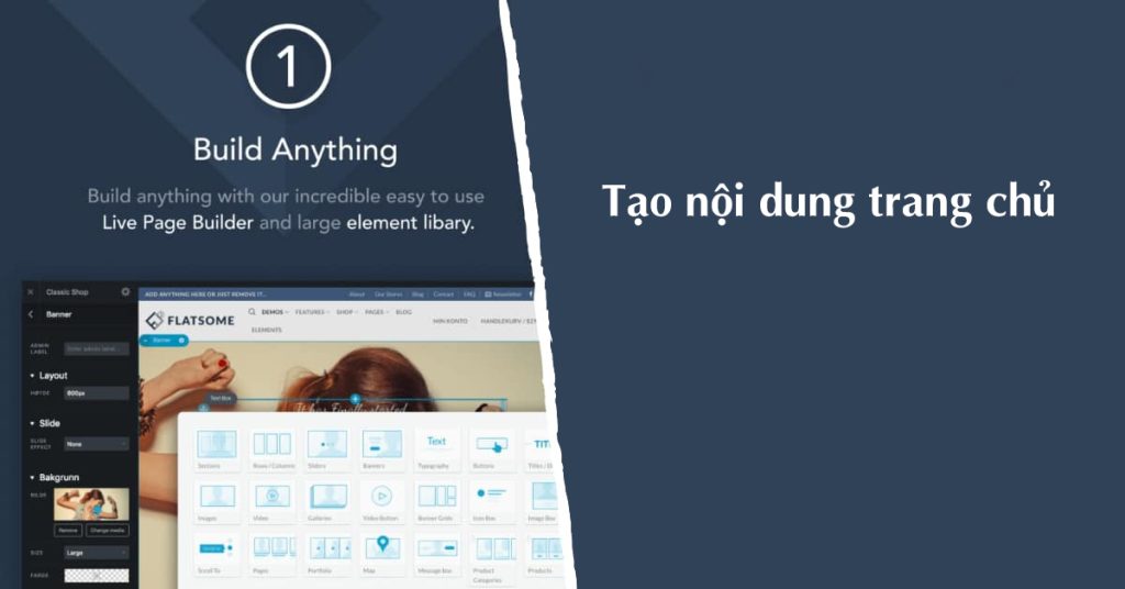
To continue shaping the homepage using UX Builder, follow the same approach as in the previous post. After the Ingredients Grid, introduce a component called Gap to add space, setting its height at 30px.
Once done, establish a new component named Row for organizing content. Within this row, include a column for content placement.
For the content within the column, click on "Add to Column" to insert a Title component. Customize the title to "BEST SELLING PRODUCT" along with the desired color and icon.
Subsequently, integrate a Products – Best Selling component to showcase the top 8 selling products. Configure the settings to display the specified number of products.
Duplicate the Row layout for the next section, titling it "LATEST PRODUCTS." Swap out the Products – Best Selling with Product – Recent to showcase the newest products, also set to display 8 items.
Create a new Row with a column, editing the Width of this row to be Full. Insert a Banner component in the column using the Simple Center type, customize its height to 300px, add a background image, and adjust the Text and Button elements accordingly.
Repeat the process for a Row dedicated to new posts, adding a title "NEW POST" to the column. Incorporate Blog posts into the column, then save the changes and update the page to preview the layout.
In summary, the homepage layout with Flatsome is taking shape, with the footer section pending an update. Stay tuned for the upcoming article focusing on creating a visually appealing Footer for the website.
Feel free to rate this article and share your feedback!


