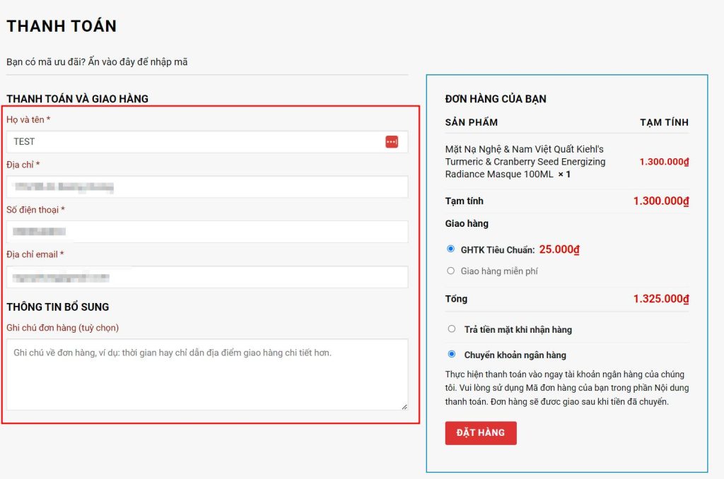
This article discusses how WooCommerce, a plugin for WordPress websites, may not be suitable for the purchasing habits of Vietnamese users due to its complicated default checkout page. The article provides a solution to streamline the checkout process by rearranging and customizing the billing and shipping fields through code injections in the theme’s function.php file. It also includes CSS customization to improve the visual appearance of the checkout page. Overall, the article aims to help WordPress users create a more user-friendly and efficient checkout experience for their online stores.
If you’re into WordPress websites, then WooCommerce is probably already on your radar. It’s a powerful plugin that facilitates online sales for WordPress sites. However, one common complaint is that the default checkout page can be quite confusing and not user-friendly, especially for Vietnamese customers.
To tackle this issue, I’ve gathered some tips from the blog of Lê Văn Toản to share with you. These tips can help streamline and improve the usability of the default WooCommerce checkout page.
Bước 1: Chuẩn bị code
First things first, you need to prepare some code snippets to add to your theme’s function.php file. Here’s a compiled set of code snippets that you can use without much hassle.
Bước 2: Chèn code vào function.php
Simply copy and paste the entire code snippet into your theme’s function.php file. For the Flatsome theme with a child theme, paste the code under Appearance > Editor > Select the child theme > Function.php. Make sure to paste it at the end of the file, as the default function.php file usually starts with <?php.
Bước 3: Css tùy chỉnh
Next, copy the CSS code snippet provided below and apply it to customize the appearance of your checkout page. Once you’ve added the CSS code in the custom CSS section, save it and see the results for yourself!
p.form-row-first, p.form-row-last{width:100%}
.woocommerce-billing-fields input{margin-bottom:0}
#customer_details label{font-weight: normal; font-size: 15px; color:#950303}
After implementing these changes, you can enjoy a more streamlined and visually appealing checkout process. Thank you for following along and supporting GiuseArt.com. Have a great time exploring the site!


